
Animation of the Cameron Peak fire
The wildfires that raged through Colorado in the summer of 2020 both horrified and fascinated me. I volunteered to help with the local fire response one day as a way to better understand how the fires are fought. I also made a data visualization to help satisfy my curiosity about how the fire progressed. This blog summarizes the data used and the decisions made to generate an effective and intuitive animation of the Cameron Peak fire.
Introduction
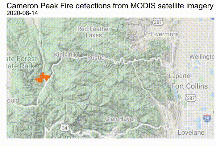
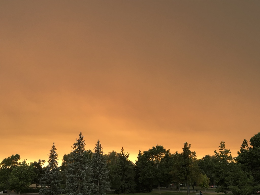
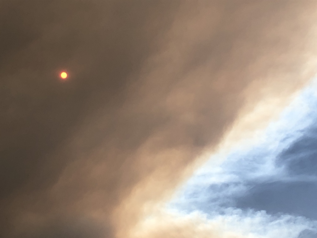
During a particular dry summer, a fire of unknown origin began burning on August 13, 2020 near Chambers Lake, Colorado, roughly 60 miles from my house. It quickly became the largest wildfire in Colorado history, burning a total of 208,663 acres (236 square miles) before being fully contained on December 3. While we were not impacted by the fires every day, some days they created a complete hellscape: the sky turned dark orange, ash and burned pine needles rained from the sky, and very little time could be spent outside without throat and lung irritation.
The fires were the talk of the town. One day, we would hear “Red Feather Lakes is in danger” and a few weeks later: “Supposedly Estes Park is going to be evacuated”. One day, the fire was close enough to town that we could see it from atop the hill across from our house. I could not get a sense for how this fire was moving, and the existing progression maps were unintuitive for understanding the movement of the fire. I decided I was going to try to find a way to collect up-to-date information on the fire’s progression and use it to animate the fire’s progression.
Process
Data collection
There are many sources of data that track wildfire location. I wanted a reliable data source that included geospatial data as a daily time series. I ultimately ended up using data collected by the USDA Forest Service and the Active Fire Mapping Program based on thermal satellite imagery from MODIS sensors onboard NASA’s Aqua and Terra satellites.
The data can be found here. The raw data includes collection timestamps, latitude and longitude of 1 square kilometer zones where fire was detected, and confidence that detections are valid.
Animation
While I experimented with plotting squares to represent the 1 square kilometer zones mentioned above, I felt it distracted from the main message. I decided the best representation would be to use the centroids of the square zones as single data points instead.
I altered the data points to be more opaque when the confidence of the detections were high and to be more transparent when the confidence was low. This forces the viewer to focus more on the locations where fire was most likely to be burning. The points in orange indicate the zones with active fire detections on the specified date. Locations with fires that are no longer detected are maintained on the map in black to approximately represent the burn area.
Additional Information
I shared the final map with family and friends, and I also decided to post to reddit on the ‘r/dataisbeautiful’ and ‘r/fortcollins’ subreddits, where it was well received.
Please find the publically available R Markdown file I used to read and manipulate the date, generate the desired map, and plot it as an animation here.